
Rebranding is never easy. Initially, the idea was to create a simple brand book for the company with the existing assets. But all of a sudden, the project took off and here we are. Welcome to Edkimo’s rebranding process!
Rebranding
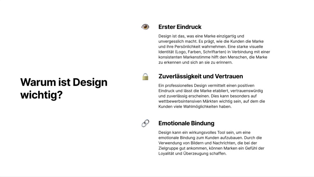
Rebranding refers to the process by which a company, product or brand is given a new image. This can be done by changing the name, logo, design, slogan or the entire marketing strategy. The aim of rebranding is often to improve perception among the target groups, to stand out from the competition, to react to changes in the market or to correct the brand image.
Step by step
Step one was breaking down the steps of what needed to be done: did we want to throw everything away and start fresh? Did we want to change a few colours and illustrations only? How much time did we have in order to make this process happen? The first impression was that the project could be achieved within 3 to 4 months, but reality hit when we realised there was a lot to do and we were not going to be working full time on the rebranding. It was also summer, so most of the team was on vacation!
A timeline was created, breaking down the process in four areas, each one with 3 stages. All areas had an estimated duration serving as a guide for the team to manage how much time would be spent on each task.
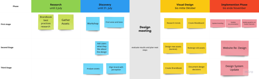
Research Phase
Part of the research phase was surfing the web searching for best branding practices, investigating approaches that would work best to work within a limited timeframe, everything that could serve us as a Design Team to up Edkimo’s branding game!
To redesign a brand, we needed to get to know the actual brand. That meant gathering the assets that made Edkimo Edkimo in the past 4 years: colours, typography, illustrations, how Edkimo communicates, which target audience does Edkimo has, which led us to the…
Discovery Phase
Discovery phases tend to be the most dynamic and fun, yet also full of new information to take in.
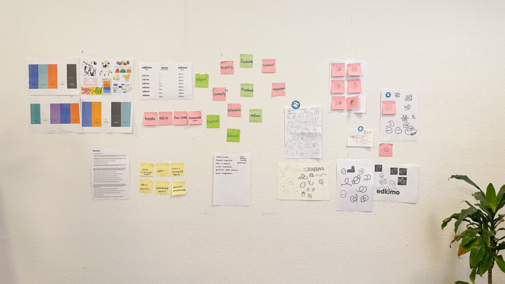
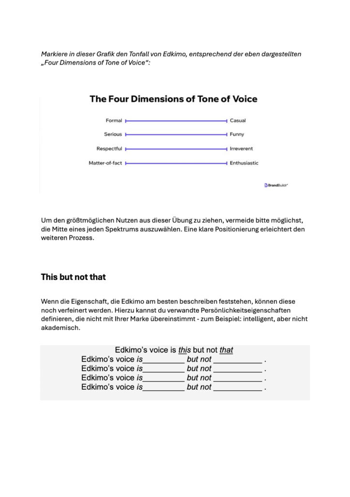
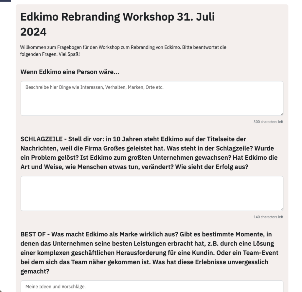
We started from the beginning and created a Worksheet, handed in directly to the founders. In this worksheet we would ask some fundamental questions about the brand, the core values, their perception of the brand and their vision for the next chapter of Edkimo.

And later on, prepared a workshop for the company to create brand awareness and get a full picture of the overall perception of the brand.

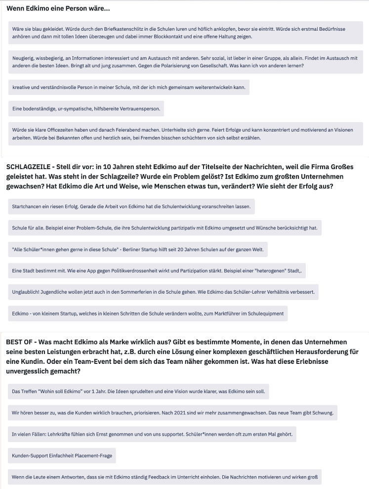
Once we gathered all the information from the workshop and the worksheets, we focused on getting the most relevant words and concepts that would serve us as the basis of the rebranding:
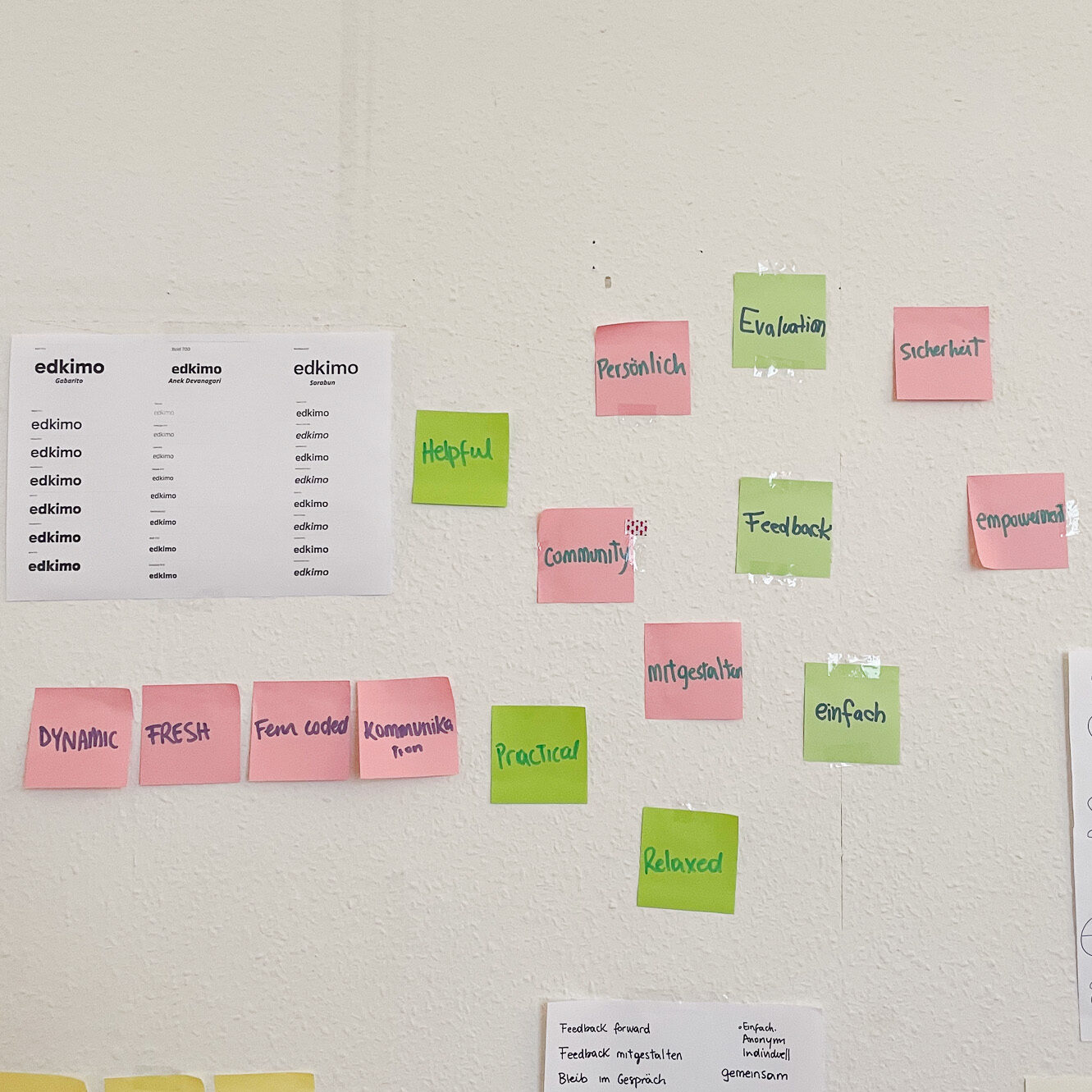
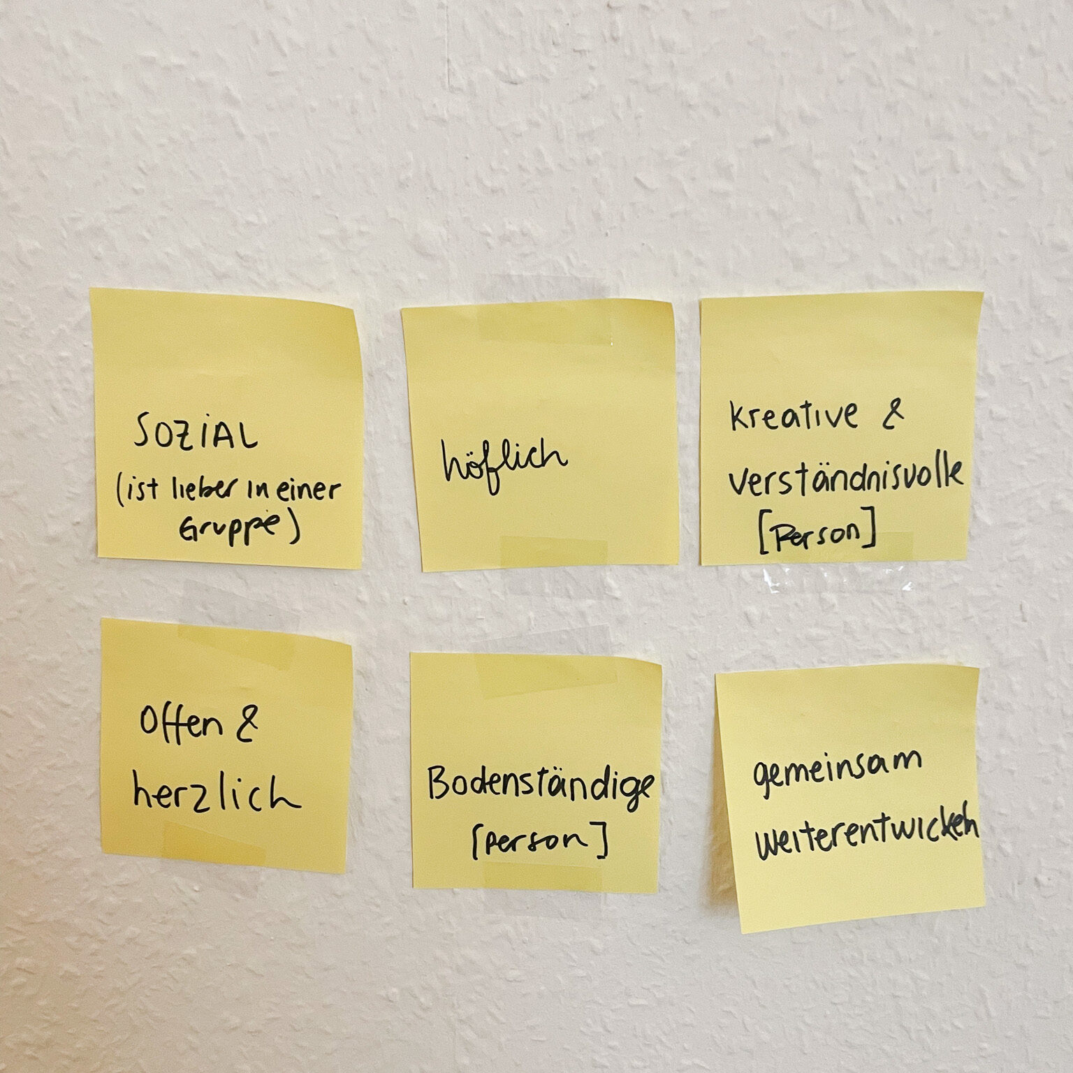
And started the journey of translating these concepts, these words, these emotions into a tangible brand.
Key information for the next steps
- We had approximately a day per week to work on Design Related tasks as a team of two.
- We would enhance Edkimo, but not create a new brand from scratch. With limited resources, we wanted to focus on what could be changed and with others, go with the motto „if it’s not broken, don’t fix it“
- We would give priority to the brand assets, leaving the logo as a secondary task.
Visual Design Phase
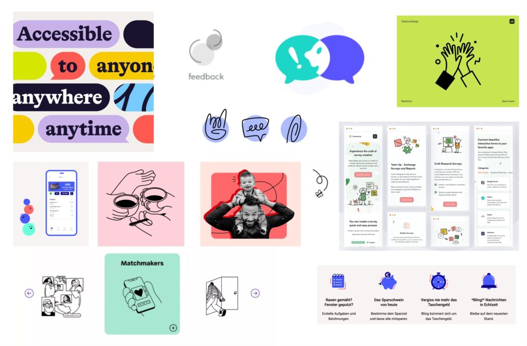
It is in this phase that set our creativity free and start brainstorming. We started by collecting inspiration: images, words and diverse elements, putting together mood boards that would help us find the direction of the brand.
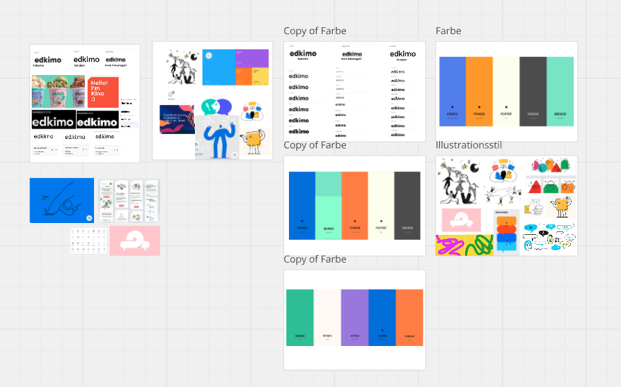
And then, we narrowed it all down into different categories to refine the elements.
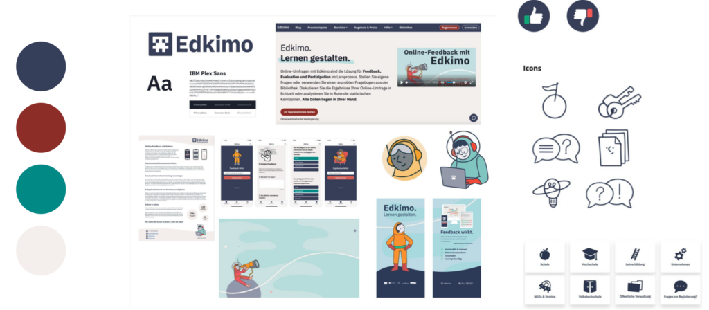
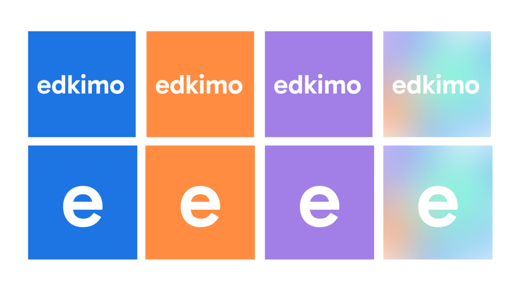
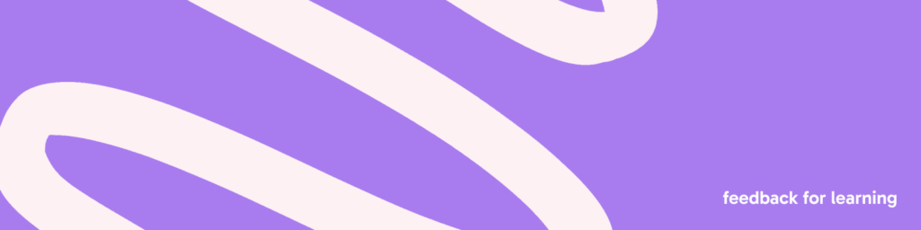
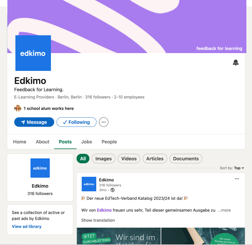
Colour Palette
We wanted to refresh edkimo’s colour palette. Bring it to life! Colours that pop, that make people excited to use the product and that can easily be used to recognise Edkimo.
Sticking to the blue as main colour, we searched for the shade that would fit best.
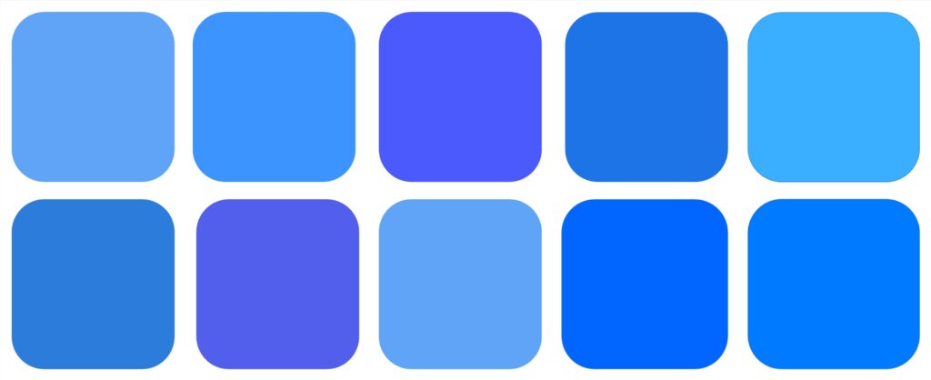
And we explored more than 50 variations of different colour palettes.

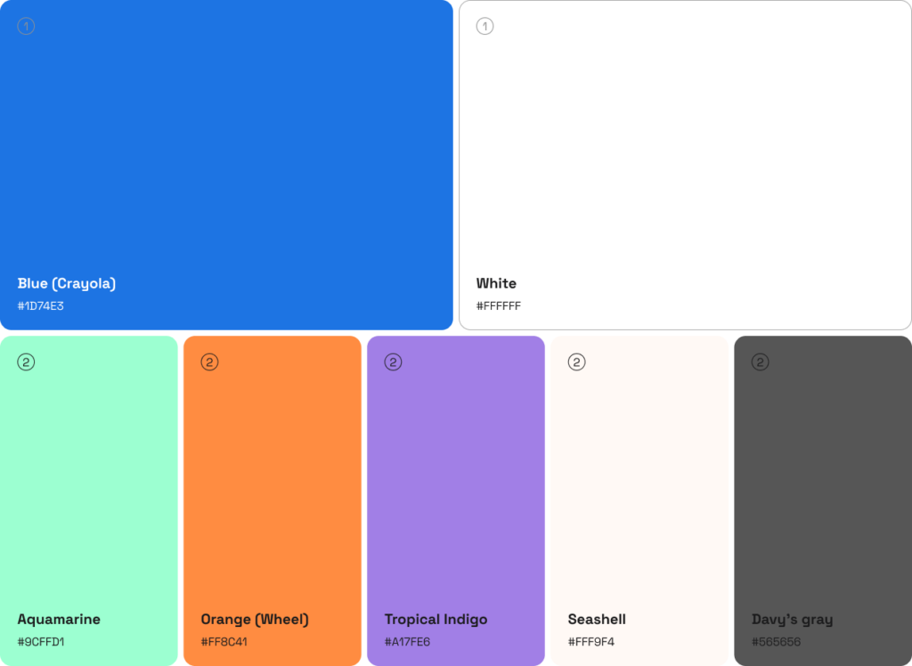
All the colours we chose were deeply rooted in the concepts, emotions and image we wanted to convey.
Blue: stability, security, trust, practical, service,
Orange: empowerment, simple, dynamic, creative
Aquamarine: relaxed, calming, fresh, feedback positive connotes
Green: helpful, correct,
Beige/Seashell: neutral, space-creating, calm
White, Black, Grey: down-to-earth, fundamental
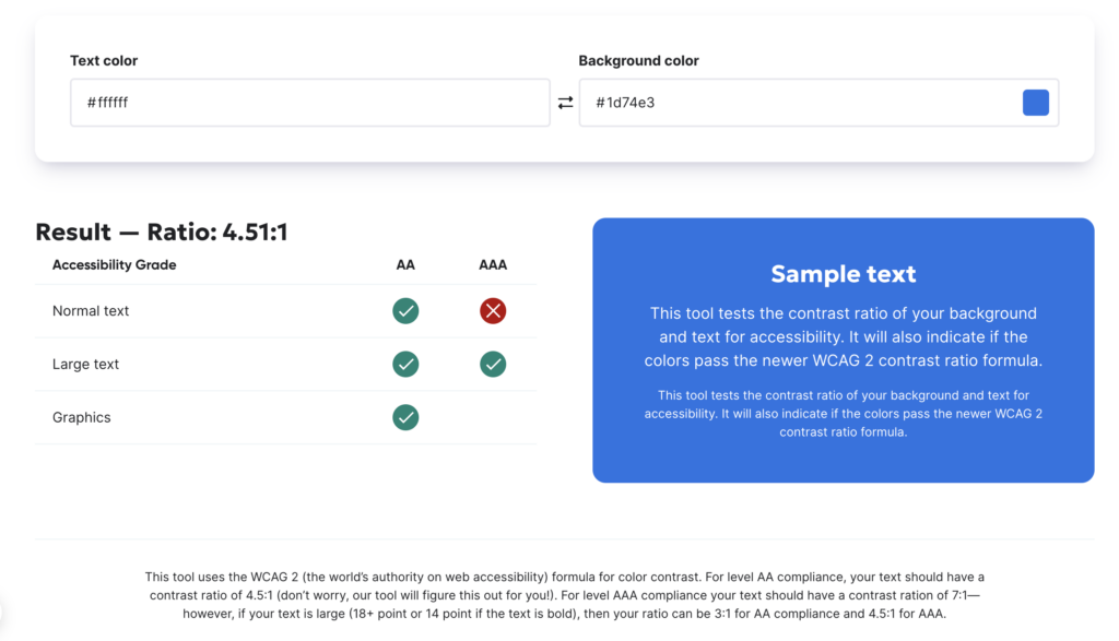
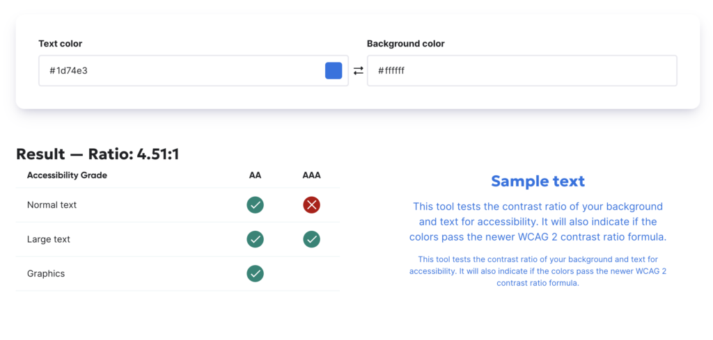
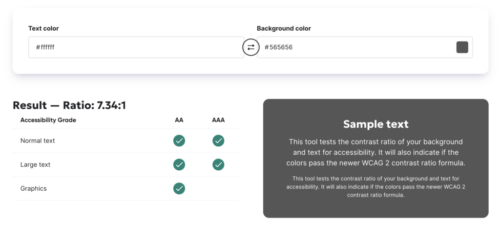
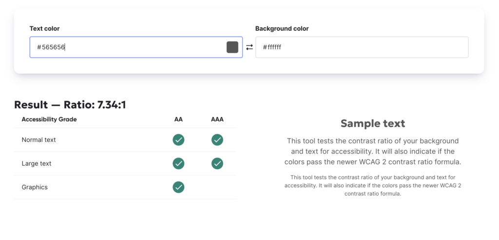
Accessibility and colours
Taking Accessibility into account, we used a tool compliant with the WCAG for the main colour combinations.
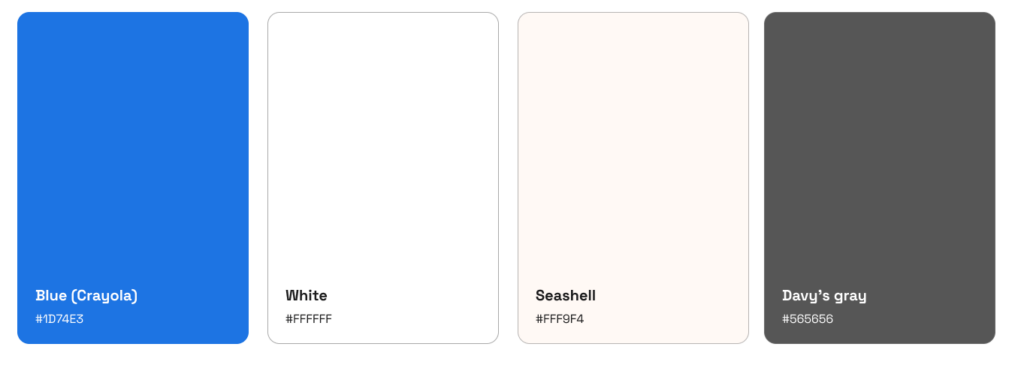
White combinations
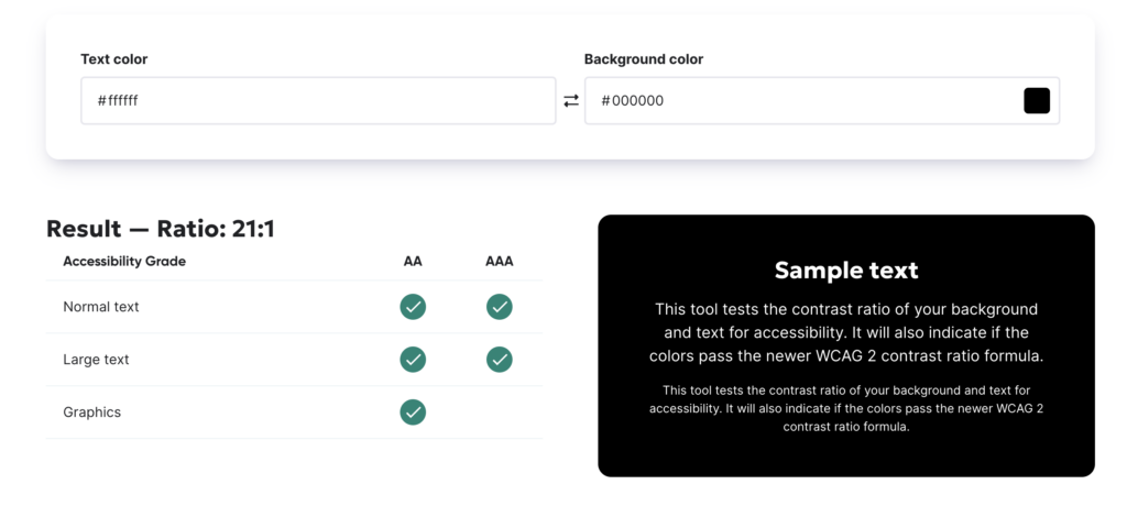
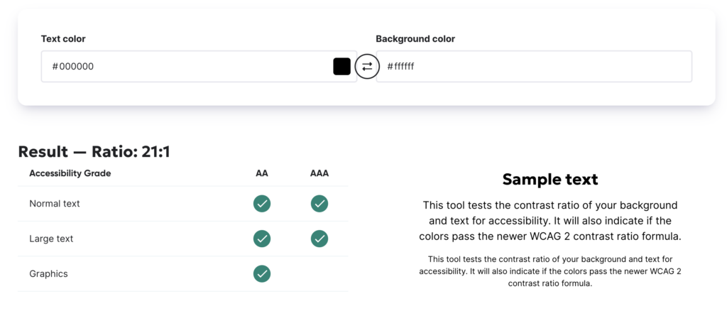
Seashell combinations
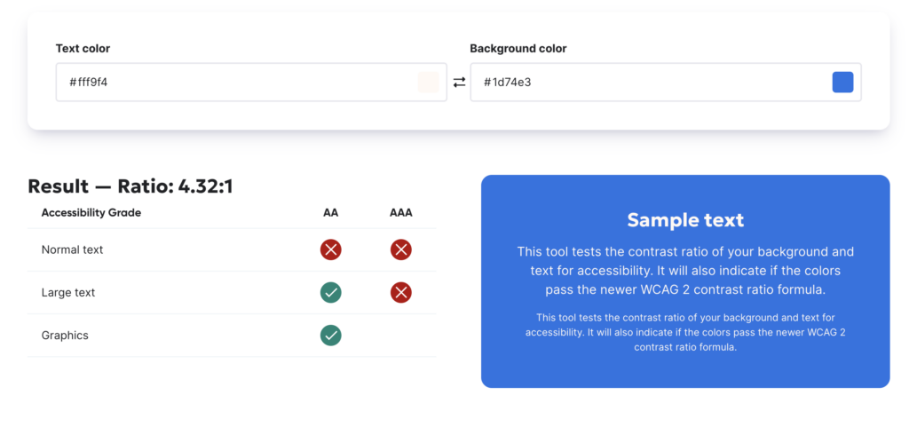
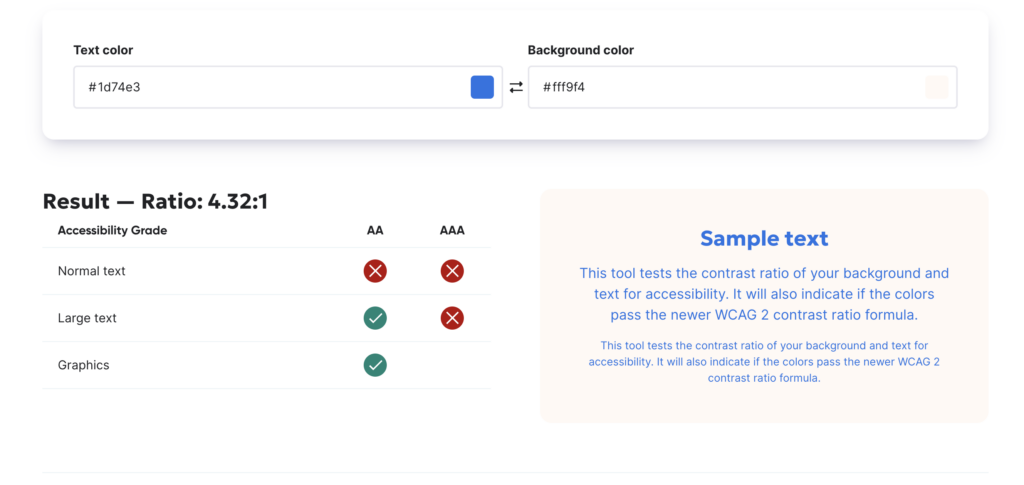
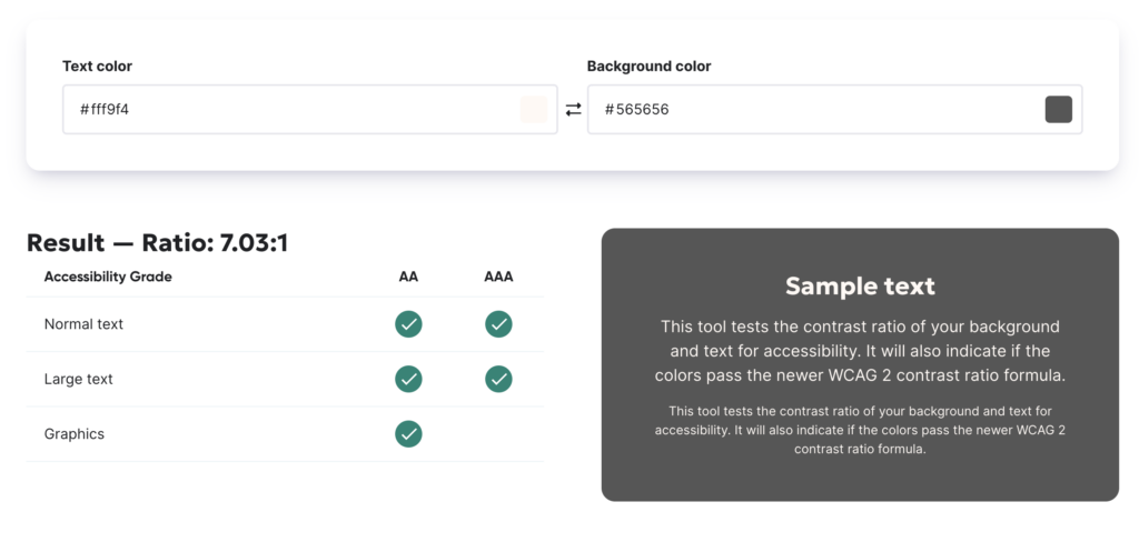
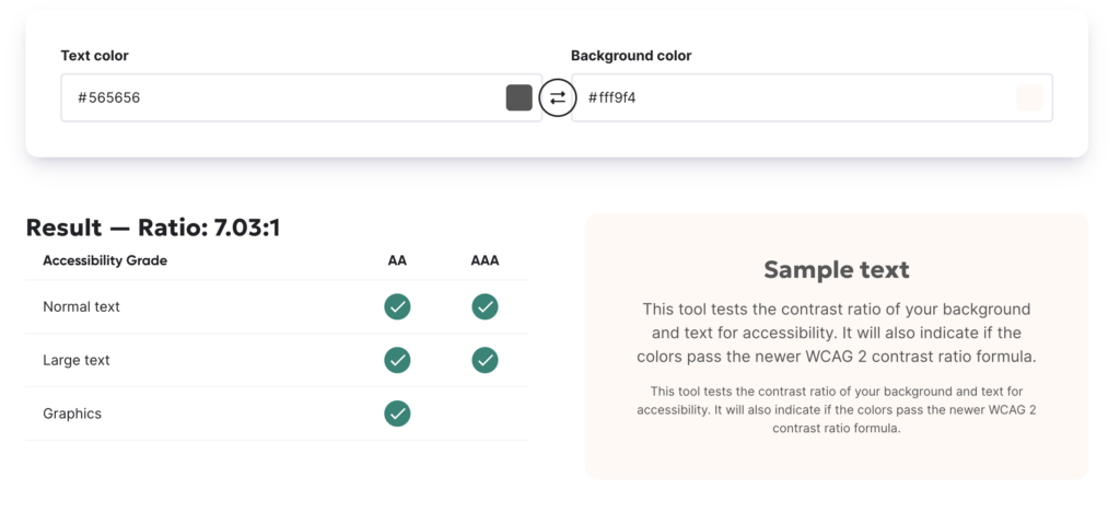
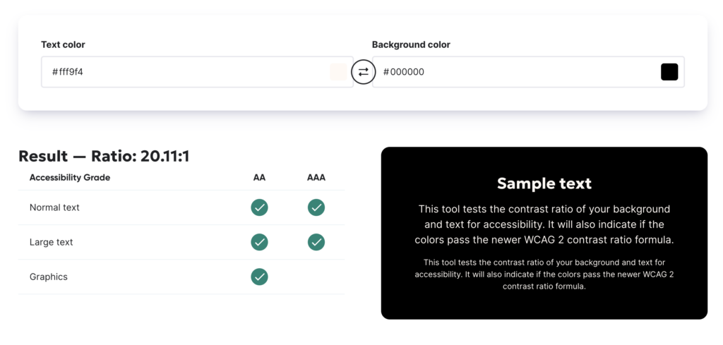

Not all the combinations are possible for all the font sizes. Certain colours are chosen to be used sparely (within the app) and as for the rest of the palette, are more thought out for design elements and branding purposes.
For the app itself, we could think about sticking to the 60-30-10 rule, 60% of the palette is dedicated to the dominant color — usually, we call it neutral. Secondary color, or complementary, makes up 30% of the palette, and a third color, accent one, is used for the remaining 10% of the design.

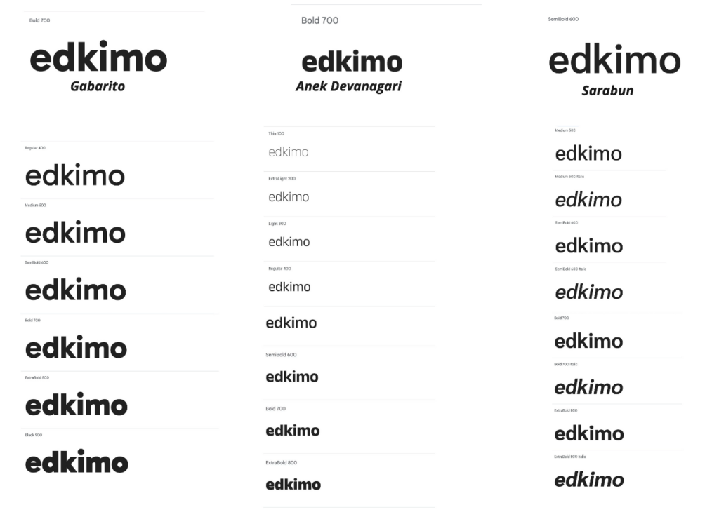
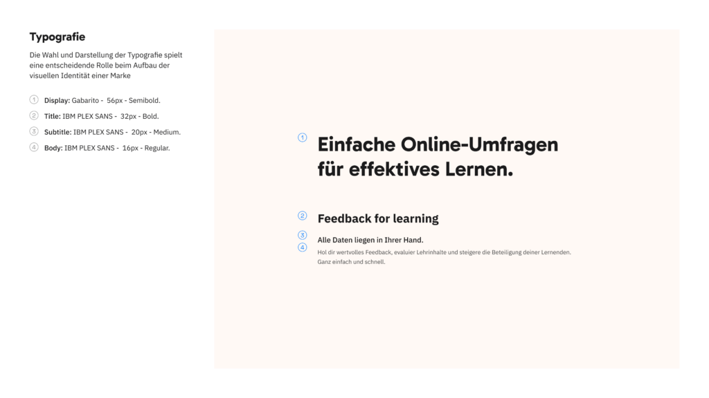
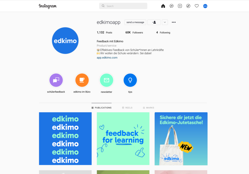
Typography
We envisioned Typography is an element that would immediately show the evolution of the brand. A type that would more open, dynamic yet practical, trustworthy and serious.
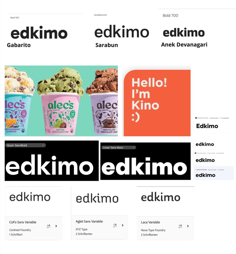
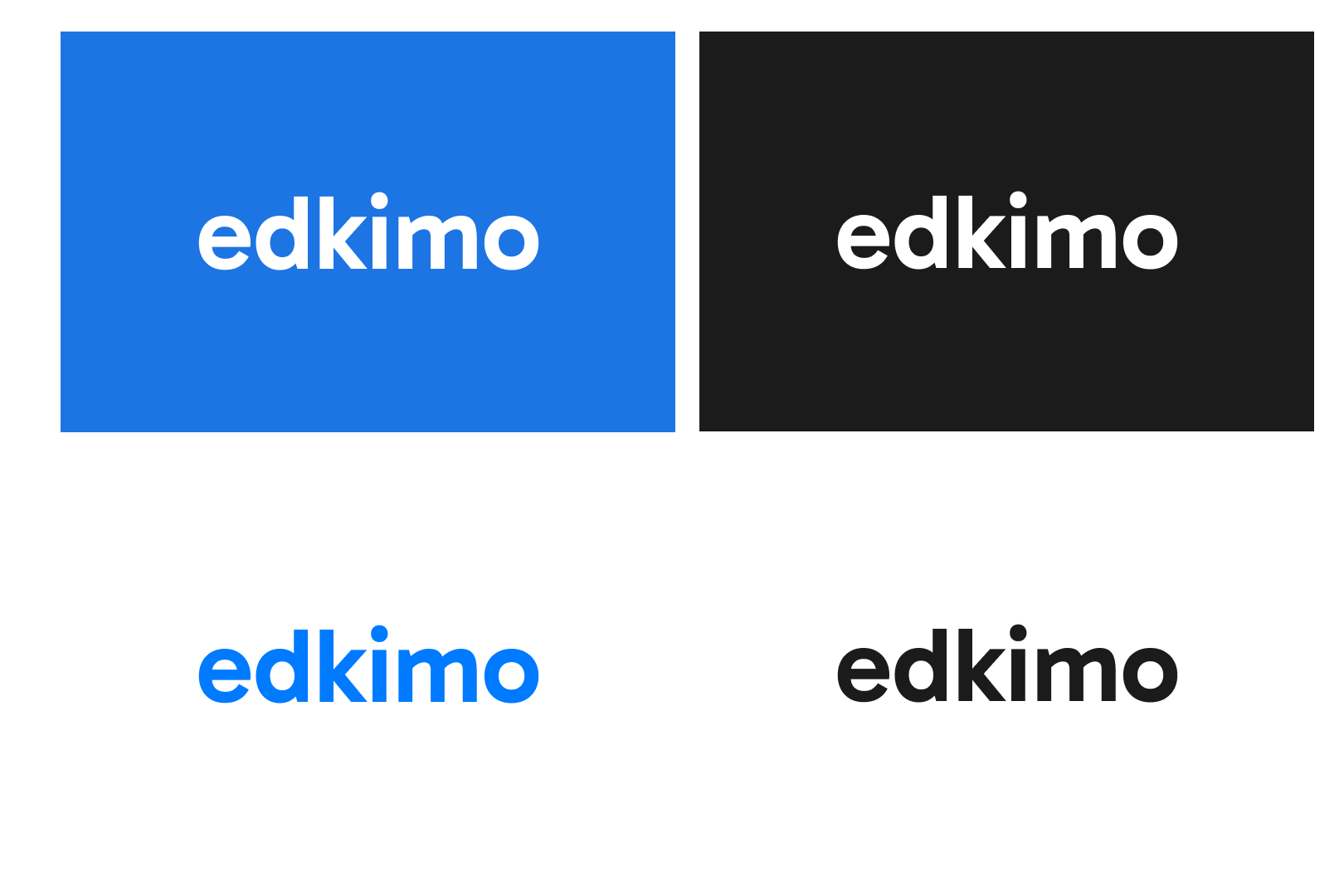
For the logo, we went for legible, bold types that would enhance Edkimo’s qualities and had a strong personality.
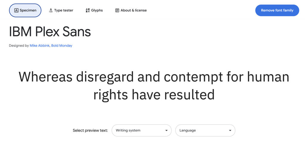
As for the text, documents and app, the IBM Plex Sans type that Edkimo currently uses works great. Therefore, we decided to keep it.
The iconography

Typography and Iconography are from Google Fonts . These are open fonts that can be accessed by any member of the team and installed in their computers.
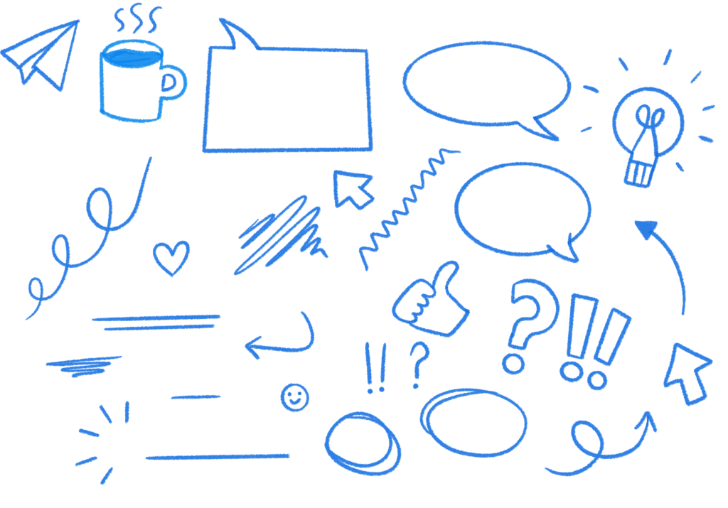
Illustration
As both designers on the team are illustrators, we wanted the images to bring more playfulness and movement to the designs. Combining bright colours with more polished lines, the illustration should give Edkimo that personal touch while making the user feel closer to the brand.
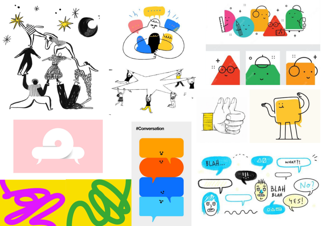
We are in the process of creating sketches and trying different shapes that will become the main illustrations for the app. We’ll be saying goodbye to the existent Edkimo universe and welcoming new characters, shapes and colours for this new chapter.
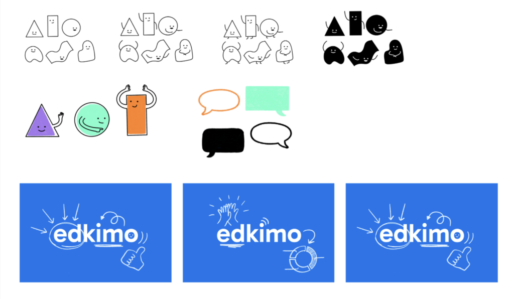
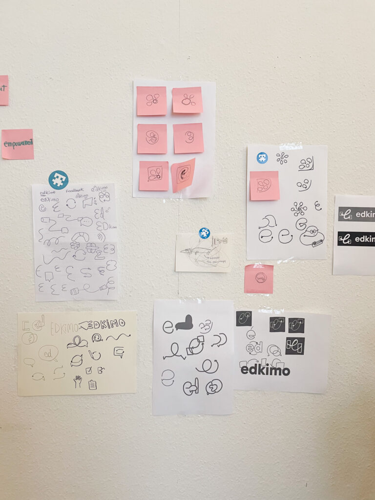
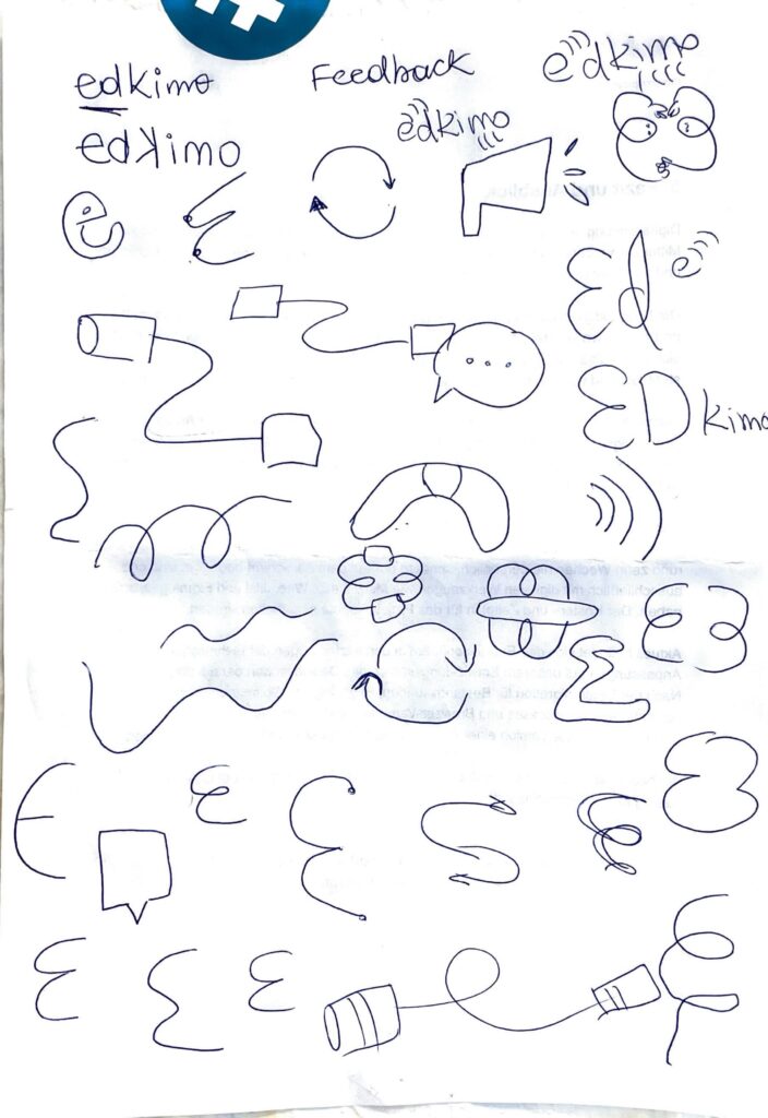
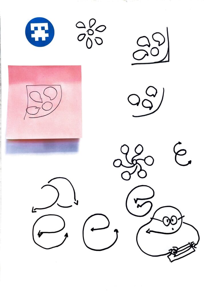
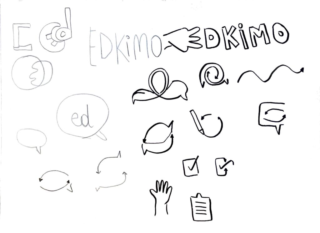
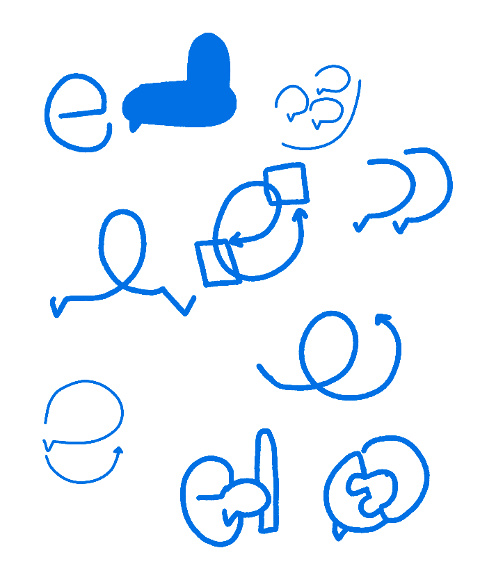
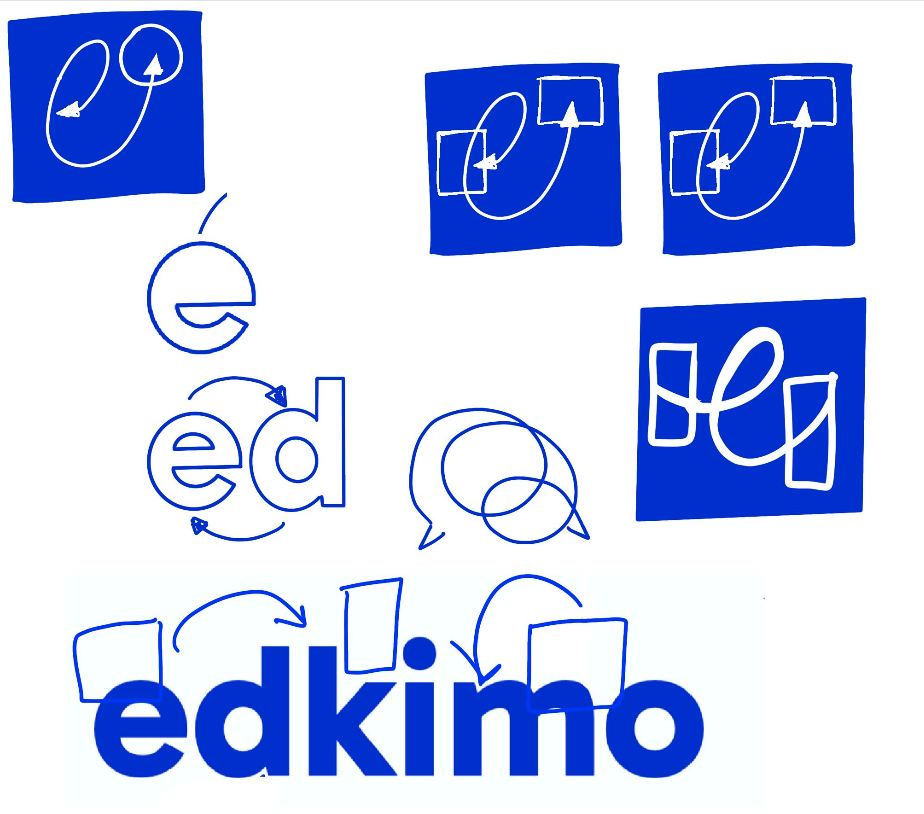
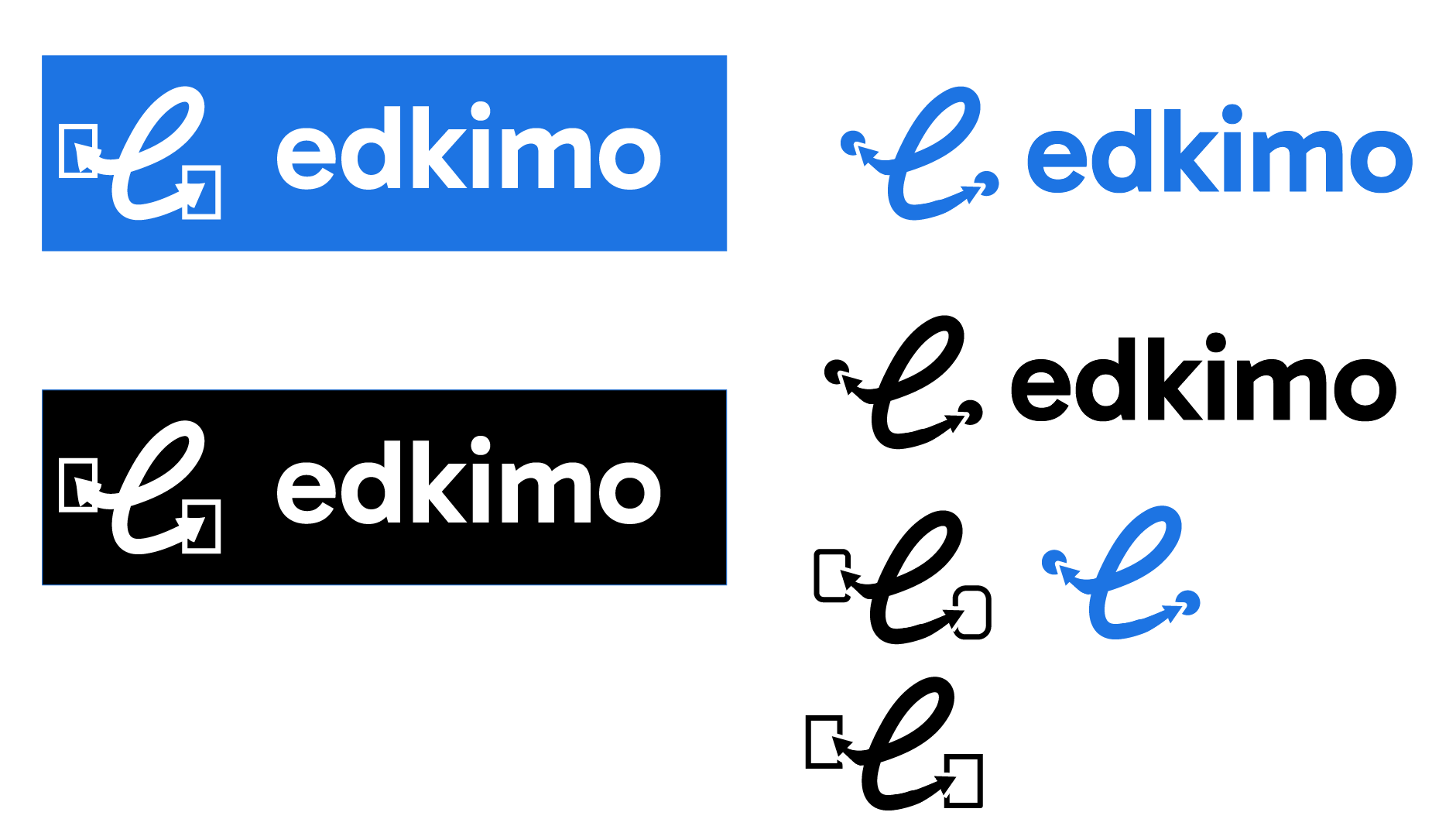
Logo ideas
The logo design was not our main priority within the rebranding. We still used a bit of our time to play around and brainstorm ideas.
Bringing it together


Landing page sketches
